-
Learn the Basics
-
- Spaces
- Space Types
- Creating Spaces
- Adding Users to Spaces
- Space Activity Stream
- Following Spaces
- Space Details
- General Space Settings
- Duplicating Spaces
- Renaming Spaces
- Changing the Space Color and Icon
- Removing Users from Spaces
- Closing and Restoring Spaces
- Moving Spaces between Different KanBo Environments
- Deleting Spaces
-
- Creating Cards
- Following Cards
- Scheduling Cards
- Renaming Cards
- Duplicating Cards
- Quick Actions
- Mass Actions
- Copy & Paste
- Archiving Cards
- Adding Cards to MySpace
- Adding Mirror Cards
- Removing Mirror Cards
- Moving Cards between Spaces
- Deleting Cards
- Removing Cards from MySpace
- Hinzufügen von Karten zu "MySpace"
- Entfernen von Karten aus "MySpace"
- Hinzufügen von Status
-
Visualize Work
-
- Space Views
- Creating Space Views
- Personal and Shared Space Views
- Card Grouping
- Filtering Cards
- Display Settings
- Work Progress Calculation
- Grouping Description
- Card Grouping Settings
- Changing the Order of Groupings
- Changing the Order of Space Views
- Deleting Space Views
- Following Card Statuses and Custom Fields
-
-
Collaborate
-
Level Up Your Work
-
Work Securely
-
Integrations
-
- Advanced KanBo Actions in Power Automate
- Creating KanBo Space Attached to Subfolder Created by Power Automate
- Creating Document Folders in Document Libraries Created by KanBo with Power Automate
- Exporting Space Views to Excel
- KanBo and Azure Logic Apps Integration
- Power Automate Integration: Triggers and Actions
- Seamless Import from Microsoft Planner to KanBo
- Synchronizing KanBo with Outlook Calendar
- Using KanBo Outlook App
-
Customizing Timeline View
This post is also available in: Deutsch
Group
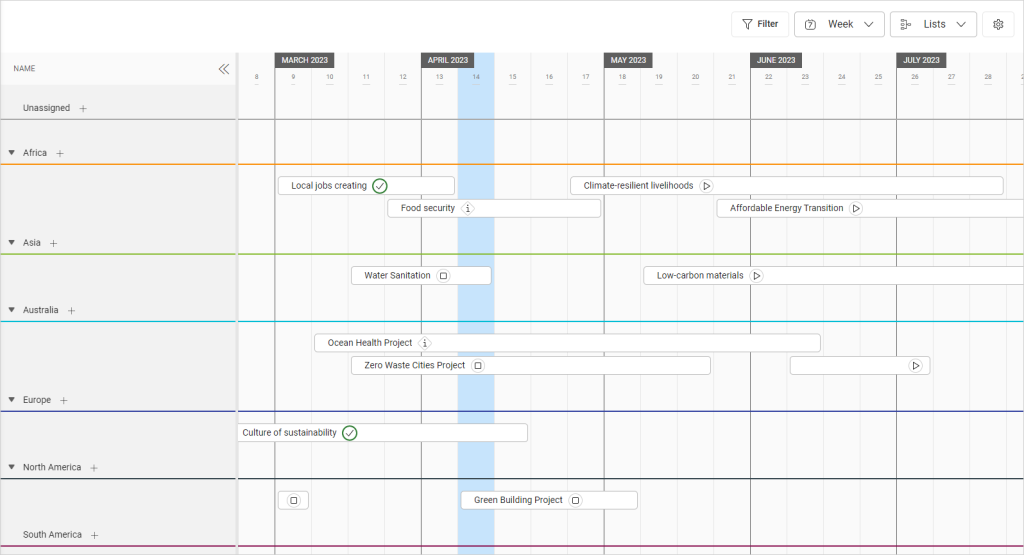
In the example below, there is a Timeline view grouping by lists presented.
Read more about card grouping.
Adjust Display Settings
Go to ![]() Display Settings, where you can:
Display Settings, where you can:
- show/hide users on card fronts
- reverse groups
- show/hide card names
- scroll only (disable/enable editing on touch devices)
- set row high (S, M, L, XL)
Filter
Read more about card filtering.
Was this article helpful?
Please, contact us if you have any additional questions.


